In a Nutshell
Web Design: Strategy and Information Architecture | California Institute of the Arts | Figma, Balsamiq, Adobe Illustrator | 2023

A project goal
I was tasked with designing a website for a delivery-only restaurant startup. The primary goal was to create a user-friendly, functional platform that allows nearby customers to browse the menu, customize their orders, and schedule delivery.
The focus of this project was not just on visual design, but also on strategic UX planning, ensuring that both user needs and business goals were aligned from the beginning, to make a streamlined online ordering experience tailored for clarity, speed, and ease of use.
Design Process
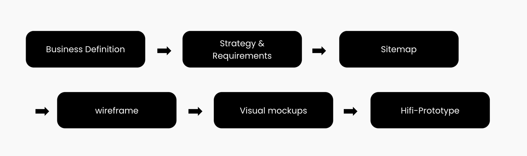
Business Definition
Coming Up with an idea for a restaurant
Before diving into the design, I first developed a concept for the restaurant business. This involved setting key factors such as the type of food offered, the primary target audience, the restaurant’s price range, and its name. Defining these details early helped me approach the project with a real-world mindset.


Strategy & Requirements
Creating a strategy
Using the restaurant concept as a foundation, I developed a strategy that aligns both user needs and client goals. This strategy guided all design decisions, ensuring that the website would support the users’ lifestyle and values while helping the business succeed.


Defining Scope: Content & Functionality Requirements
After identifying both user and client needs, I translated those insights into a clear list of content and functionality requirements. These defined the core features and structure of the website and became the foundation for the information architecture and user interface design.

Sitemap
Designing a Sitemap
After the content and functionality requirements were defined, I translated them into a clear navigational structure. This sitemap outlines how users can move through the website and access key information with ease. The goal was to create a logical and intuitive flow that supports both browsing and task completion.

Wireframe
I created low-fidelity wireframes using Balsamiq to quickly explore layout and structure, stepping away from my usual tool (Figma) to test a new workflow.
Wireframes were designed for both desktop and mobile. In some cases, longer desktop screens were broken into multiple mobile views. The focus here was on information hierarchy and flow, not pixel-perfect alignment.
Creating a Wireframe


Visual Mockups
Creating a Moodboard
To gather inspiration for how my restaurant concept would be represented and what it would look like in a visual mockup, I collected images related to the concept and created a mood board. Since I decided to create a website for the Korean food restaurant, I collected traditional Korean patterns and images of Kimbap to draw inspiration from.
Inspired by the look and feel of the moodboard, I designed the main visual mockups for both desktop and mobile. The goal was to reflect the brand’s identity, which is modern, simple, and grounded in Korean culture, while keeping the interface intuitive.
Visual mockups : Full set
Key Mockups for mobile
High Fidelity Prototype for Mobile


Branding: Logo, Typography & Color Palette


High Fidelity Prototype for PC

Hifi-Prototype


Building on the visual direction from the moodboard, I established the core branding elements for the restaurant’s website. These include the logo, primary color palette, and typefaces, which were designed to reflect the brand’s cultural character.

Creating Visual Mockups
Key Mockups for PC


After designing the visual mockup of the main page for both PC and mobile versions, I created the rest of the visual mockups for the site, focusing on the ordering process.
Takeaways & Reflections
This project taught me that UX design is not just about creating something that looks good, but it’s about designing with purpose, for both the user and the business. One of the most valuable takeaways from this experience was learning to approach the problem from two sides: understanding what users expect from the product, while also keeping the business’s goals and limitations in mind.
Breaking down the scope into content and functionality helped me think more strategically and organize information in a way that supports both user experience and operational clarity.
I also enjoyed exploring the branding side of this project — crafting a moodboard, logo, and visual identity that captured the cultural and emotional appeal of the restaurant concept. I’ve always enjoyed conveying meaning through creativity, and this part of the process reminded me how much I enjoy building stories and experiences, not just screens.
Overall, this project gave me a more holistic perspective on UX — not just as design, but as a bridge between people, ideas, and products.