Foody
UX Design | Google Certificate Project | Figma | April 2022
Foody is a mobile food delivery app designed for busy commuters and working professionals
who care about eating healthy but struggle to find the time to cook. The goal was to create a seamless, user-friendly way to order fresh, nutritious meals without hassle or decision fatigue.
Problem
Busy adults often lack the time or energy to cook, leading to unhealthy eating habits. Existing food delivery platforms can feel overwhelming, inaccessible, or confusing, particularly for users with dietary restrictions or language barriers.
Goal
Design an app that makes it easy to discover, order, and receive healthy meals with minimal effort.
Design Process

🔍 Research
Methods: User interviews, empathy maps, and competitive audit.
Pain Point
❶ Time
Time constraints prevent users from cooking regularly.
Persona

✏️Starting the Design
Outline a User Flow
Defined the steps from restaurant selection to checkout.

Creating a storyboard
Explored both the big-picture daily context and detailed app interaction
Big-Picture storyboard


Creating wireframes
Paper wireframes(w/a pen and paper)
Close-Up Storyboard

To quickly iterate and visualize layout ideas, I sketched multiple versions of each app screen. I marked the ones best aligned with user needs, using stars to guide the transition to digital design. This process helped focus on usability, clarity, and core functionality from the start.
Digital wireframes(w/figma)

❷ Accessibility
Unclear menus and poor accessibility frustrate users.
Building on the paper concepts, I created digital wireframes to lay out the app’s key screens. I prioritized clear navigation and accessibility, key pain points identified in earlier user research. These wireframes served as the foundation for the prototype and included screens from the home page to checkout.
To represent a full user flow, I designed 11 screens, covering: Home & restaurant listings, Menu browsing with filters, Item selection, Order summary & checkout and Confirmation screen

Low-fidelity Prototype

Using the completed wireframes, I developed a low-fidelity prototype to simulate the key user journey: browsing, selecting, and ordering food. This prototype was used in the usability testing phase.
🔄 Refining the Design
Building a research plan

❸ Lack of support
Existing apps lack support for dietary preferences and multilingual users.

Conducted unmoderated usability tests with low-fidelity prototype.

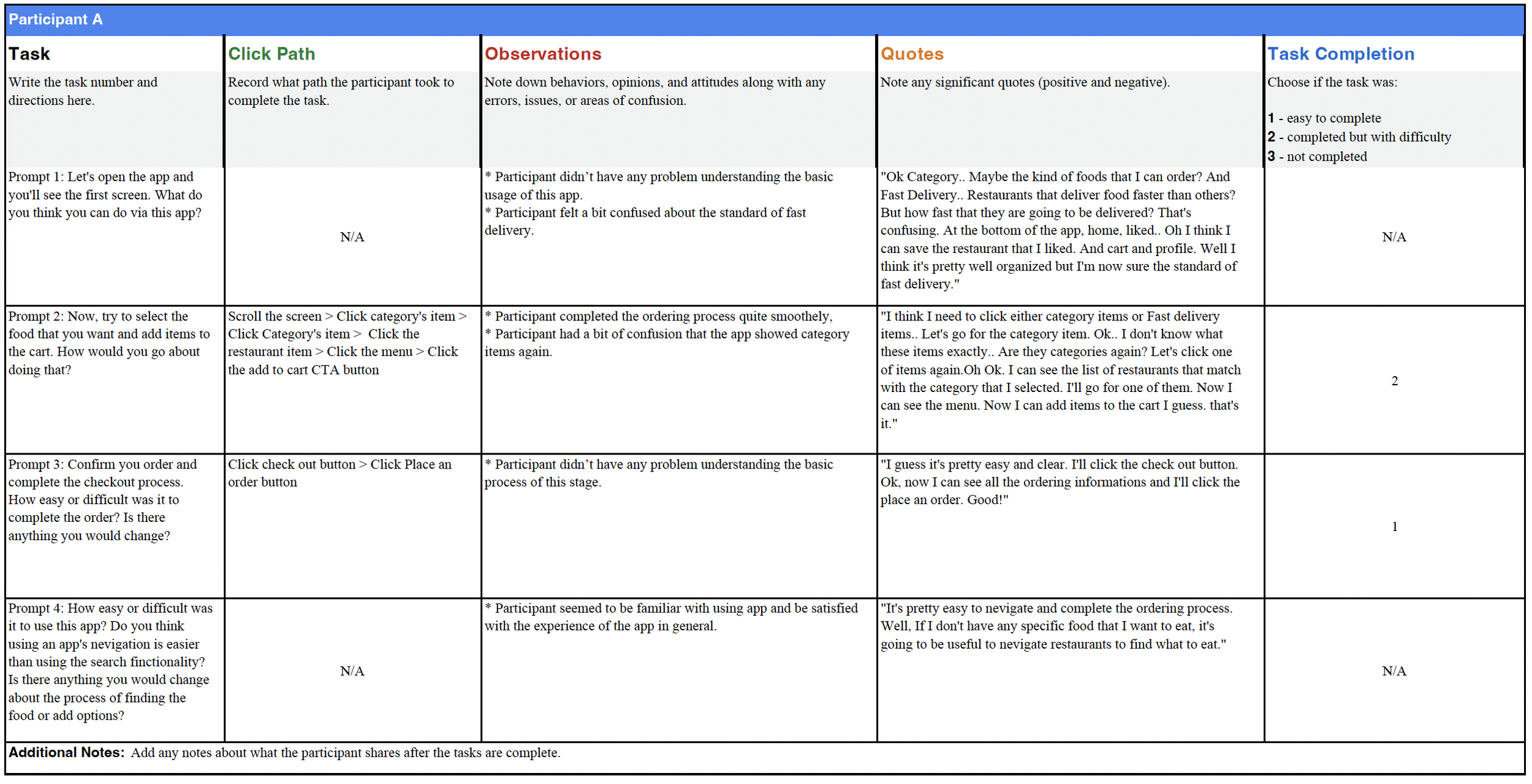
Usability Study
I used a spreadsheet to take notes about the entire usability study in one place, and here are the results.


Getting insights from observations
Affinity diagram grouped feedback into themes, revealing key usability issues.


Categorized findings into themes
Here are three key usability themes that emerged during the study.


Insight Identification
Here are three key insights that needed to be addressed to improve the user experience.
💡 Insight #1: Lack of Clarity Around “Fast Delivery”
Problem: Users were confused about what “Fast Delivery” meant — specifically, how fast is “fast”?
Solution: I clarified the estimated delivery time next to the "Fast Delivery" label so users can immediately understand the expectation.

💡 Insight #2: Redundant Category Screens
Problem: After clicking a category on the home screen, users were taken to another screen showing the same categories again, which felt repetitive and confusing.
Solution: I updated the flow so clicking a category leads directly to relevant restaurant listings.


💡 Insight #3: No Option to Edit Shipping & Payment Info
Problem: Users expressed frustration at not being able to edit shipping or payment details during the checkout process.
Solution: I added clear “Edit” buttons next to both fields so users can make adjustments easily.
Creating high-fidelity mockups and prototypes (w/figma)
This prototype includes:
Updated UI with brand colors, typography, and imagery
Clear navigation and improved user flows (based on insights)
Interactive features that reflect real app behavior
Solutions to pain points discovered during usability testing
Key Mockups

High-fidelity prototype
The final high-fidelity prototype delivers a cleaner user flow for menu selection and checkout, while also addressing user needs with the option to edit order details.


User Journey Map
To identify potential obstacles and emotional friction points during the user experience, I created journey maps


Problem Statement
Tina’s Problem Statement
Tina is a busy working adult who needs easy access to healthy food options because she doesn’t have time to cook but still wants to maintain a healthy lifestyle.
John’s Problem Statement
John is an exchange student who wants to explore diverse local foods but struggles due to language barriers and unfamiliar menu options. He needs a food delivery solution that offers clear, accessible descriptions so he can confidently order and enjoy local cuisine.
Value Proposition
Foody delivers a fast, confidence-boosting food ordering experience by focusing on clarity, accessibility, and low-effort decision-making.

Competitive Audit
Evaluated existing apps for ordering flow, customization, accessibility, and transparency.


💡 Key Takeaways:
Strengths: Streamlined ordering flows, well-designed filtering systems, customer reviews, loyalty programs
Weaknesses: Overwhelming interfaces, lack of customization, accessibility limitations, and minimal transparency around food quality
Opportunities for Foody: Dietary filters, multilingual support, clear food quality information, and friendly brand tone.
🎓 Takeaways
Impact
The app offers users an easy-to-navigate and helpful experience that supports their busy lifestyles.
“I think it's easy to navigate in general. Because it is organized by the types of food, I can easily browse and find what I want to order. And the fast delivery option seems to be useful as well. I’d use this app.”
- Peer feedback
What I learned
While completing this project, I realized that design is more than just aesthetics; it’s about solving real problems.
Through user research and usability studies, I learned the value of listening closely to users' needs and pain points. That user-centered mindset guided each decision I made and helped shape a product that’s not only functional but genuinely useful for real people.