ArtWith
UX Design | Google Certificate Project | Figma | December 2022
ArtWith is a conceptual responsive website that helps users discover current art exhibitions, explore museums, and learn about art in an approachable way. This project focused on designing for mobile, tablet, and desktop devices and on understanding how user needs shift across devices.
Problem
Although people aged 16–24 make up 15% of the population, they represent only 10% of museum-goers (Audience Agency, 2018 report ). Many feel that art is intimidating or inaccessible, with no clear entry point to start learning or visiting exhibitions.
Goal
Design a responsive website that improves access to art-related information and helps users, especially younger audiences, engage with exhibitions and art education more easily across desktop, tablet, and mobile devices.
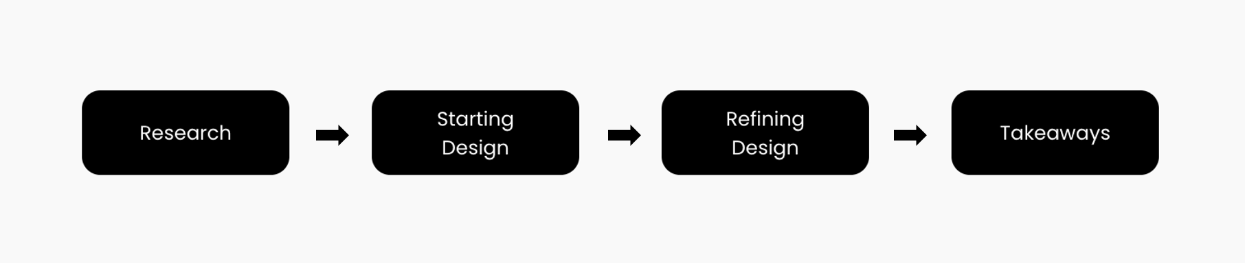
Design Process
🔎 Research
Summary
User interviews highlighted a desire for simple, reliable access to exhibition information, as well as approachable educational content. Participants described wanting a single place to browse exhibitions, learn about artworks, and stay updated without navigating multiple sources.
Persona
Two personas were developed to capture key motivations and behaviors.
✏️ Starting the Design
The design began mobile-first, focusing on a clear content hierarchy for browsing exhibitions, discovering featured artworks, and engaging with educational material. Wireframes emphasized simplicity and fast access to essential content.
Low-fidelity Prototype
A low-fidelity prototype to test the early user flow, focusing on browsing updated art information and locating nearby exhibitions. The prototype connected several key screens that simulate a user discovering and selecting an exhibition to view more details.
Building a research plan


User feedback was synthesized through structured notes and affinity mapping.
Usability Study Findings

Notes taken during the usability study sessions were organized to capture participant reactions, behaviors, and pain points.
Findings
❶ Users need filtering options
- Participants wanted ways to easily sort the exhibition list by factors like date, location, or category.
❷ Calendar interaction was unclear
- Most users were unsure how to use the calendar on the profile page and what it was meant to show.
❸ Saving artworks was not intuitive
- Several users struggled to understand how to save or bookmark artworks they liked.
🔁 Refining the Design


User Journey Map
User journey maps revealed friction when users attempted to compare exhibitions, understand artwork context, or access reliable information across platforms. Key emotional moments and decision points informed opportunities for improvement in content clarity and navigation.


Problem Statement
Linsey’s Problem
Lindsey needs an intuitive way to discover and compare exhibitions because current information is scattered and inconsistent across sources.
🧩 Combined Problem Statement
Tom’s Problem
Tom needs a simple way to study artworks consistently because he wants to build knowledge without searching across multiple platforms.
People interested in art, casually or professionally, need a user-friendly way to explore ongoing exhibitions and deepen their understanding of artworks. Existing sources are fragmented, difficult to compare, and often lack accessible educational content.
Competitive audits
A competitive audit was conducted to understand how other art platforms communicate value, present information, and support discovery.
Insights included:
Many competitors offered standout features, such as location-based discovery and daily art content, but few combined educational material with real-time exhibition access in a cohesive, user-friendly experience.
Limited language support and unclear UI in several platforms.
Few products offered a cohesive blend of education + real-time exhibition discovery.
These findings highlighted opportunities for clearer visual design, multilingual accessibility, and better integration of educational resources.


A usability study was planned to validate the early concept and understand how effectively users could navigate exhibition discovery and save content.

Mockups
2. Added Filter Option
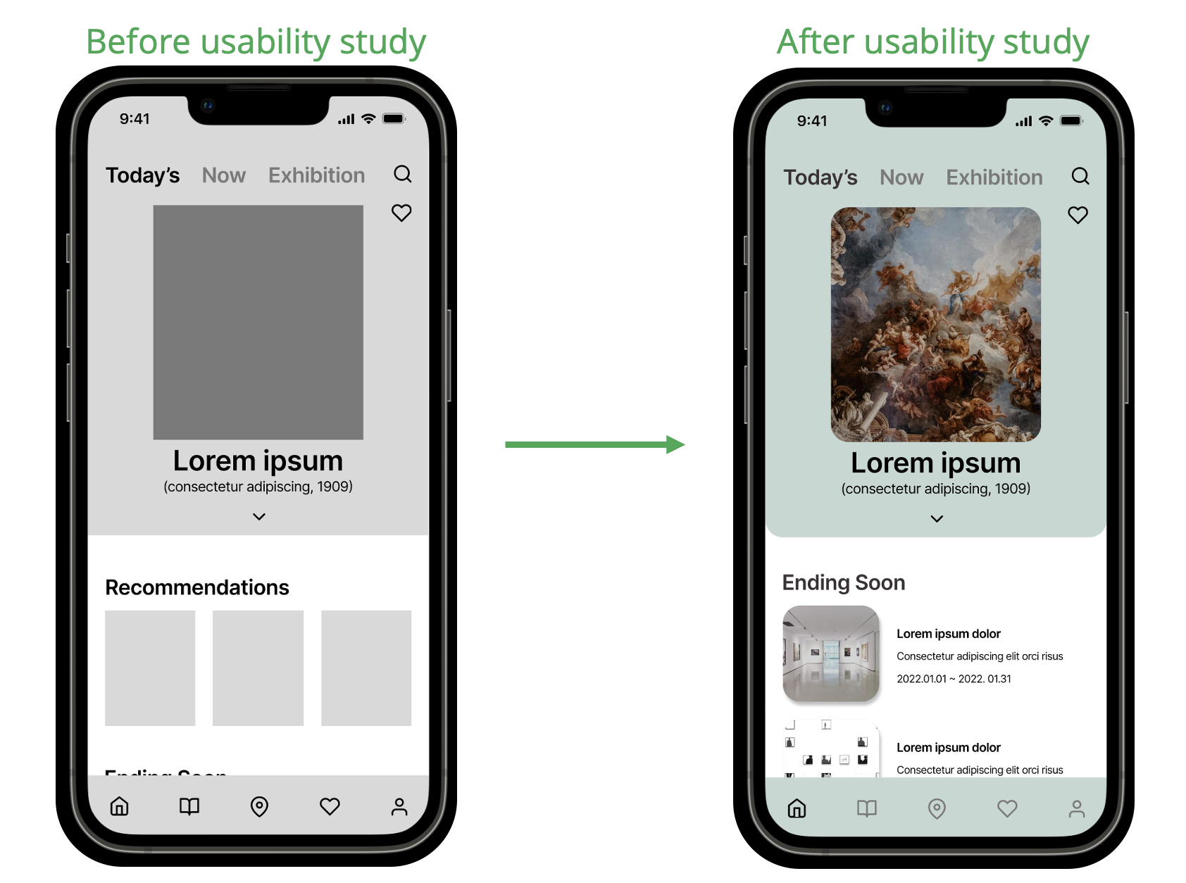
After analyzing insights from the usability study, I made key refinements to the design to better align with user needs:
1. Revised “Recommendations” to “Ending Soon”
Users preferred actionable, time-sensitive information. The section was reframed to improve relevance and urgency.
To help users easily find exhibitions that match their interests, I incorporated a filter feature allowing them to sort exhibition lists by specific criteria(e.g., date, type of art).

3. Pop-up Confirmation for Booked Exhibitions
When users select a date for an exhibition, a pop-up message now confirms their booking. This helps users manage their schedules more effectively and ensures they don't miss out on upcoming visits.


Key Mockups
Here are four key refined mockups that represent the updated design direction. These changes aim to enhance usability, simplify navigation, and ensure a smooth user experience.
High-fidelity Prototype
After incorporating feedback and design changes from the usability study, I created a high-fidelity prototype that follows the same core user flow established in the low-fidelity version.
This prototype reflects:

View the High-fidelity prototype For ArtWith
Core Features of the App based on users’ needs
Daily featured artwork
Current and ending-soon exhibitions
Filters for tailored results
Articles and art-related updates
Exhibition details with artwork previews
🖼️ Art Exploration & Discovery
🗂️ Personal Management
➰ Responsive Design
Sitemap

This sitemap helped organize content for larger screens (tablet and desktop), clarified the overall structure, and ensured a consistent and intuitive user experience across devices.
Responsive Responsive Layouts: Mobile, Tablet, Desktop
Bookmarking for artworks and exhibitions
Easily accessible liked content
Calendar-based schedule view

Responsive designs maintained consistent branding and UI components across devices while adjusting layout density, interaction patterns, and hierarchy to suit each format.
🧠 Takeaways
Impact
Users shared that the app would help make engaging with art feel more approachable and accessible in daily life. One peer feedback quote was:
“As an art enthusiast, I'm definitely willing to use the app. I like the fact that I can get the information on art easily and I won't be able to miss out on the exhibition near me!”
What I learned
Working across mobile, tablet, and desktop provided a deeper understanding of responsive UX design, how content, hierarchy, and interaction patterns must adapt based on screen size to support efficient navigation.
The project reinforced the value of grounding design decisions in user needs, structuring information clearly, and ensuring accessibility for a wide range of users.
